While working as the only designer at one of my former employers (unable to say due to NDA), I was assigned to work with one of the c-suite level, 1 product manager, and 3 senior engineers to redesign and develop the proprietary platform tool for the organization. This new platform tool consists of some notable features such as:
In tangent, 2 senior engineers and I were tasked with creating a new design system for the internal platform tool. The design system at that time lacked consistency, some sections were outdated, and some components/patterns were left much open to interpretation. Due to privacy reasons, I can’t show the bulk of my work for this project but I’ll provide some insights for the design system approach.
The Client
One of my former employers
The Challenge
Implement an improved design system from the current one that would streamline design workflows, create the start-to-end deliverables quickly, and make the standardization for reusable components, typography, and color treatment.
Approach
Doing an assessment on the current design system then exploring other existing design systems on the web for references while combining best practice that is suitable for the internal teams.
Outcome
There is a new and improved design system that keep things clean and organized across the company; this will align all teams more structurally and speed up the design process as well as the development process.
Length of Project
6 months (On-going Project)
Role
Senior UI | UX Designer (leading in research, interaction design, visual design, documentation)
The current design system was outdated. As a result, the platform tool, some branding aspects, and the teams who use the design system lacked a shared foundation around the process, design language, visual guidelines, components, and UI libraries. In short, this created inefficiencies within the product and amongst the teams.
So let's start with casting the villain. Everybody loves a good villain. The Joker, Killmonger, etc. When I say a villain in the case of Design Systems, the villain is a well-framed and well-named problem. And for this case, thankfully, the villains that stand in the way can be solved by Design Systems and fairly understood and clear. There are different words for this but the villains to me the way I put them are inefficiency, insecurity, and inconsistency.
Inefficiency
Inefficiency is ultimately about designing the same things again and again. Maybe a button, a dropdown, a snackbar and Designer A designs it once and Designer B redesigns it a different way. Eventually, the stack of different design styles becomes inefficient. You can think about this from an engineering perspective as well where you have to build the same thing again and again and you're not reusing any codes.
So an example from one of the Jira tasks that I've found, an engineer has spent a fairly long time building a table cell. Then they spend another week to match up with another table cell CSS properties that were already built. Within the platform tool, there are a ton of table cells whether it is a list of employee profiles with task status or client's forecasting budgets or even project overview. They're all in the form of a table cell and so, there are many instances of a Jira task just like this. And because we didn't have any reusable code and without a design system of reusable components, it'll take an unnecessary amount of time to get it done.
Insecurity
When we actually interviewed our designers who used to work on this platform about what was problematic in their workflow and they told us they lacked confidence when they were designing. They didn't know what were the best practices are and if what they were doing was already proven to not work and so instead of growing in confidence as they spent time working on a variety of projects being a designer. There was always this nagging sense of insecurity as to what is the thing that I should or should not be doing.
An example of this is a modal. Sometimes a modal has a closed x. Sometimes it has a cancel button. What are designers supposed to do? It becomes very unobvious. Similarly, sometimes the primary action on a modal is to the left and sometimes it is to the right. There's no way to determine what is the right approach to this matter.
Inconsistency
I feel like the hatred of inconsistency runs through any designer. The users are losing confidence in the product because the interface is increasingly unpredictable. You've got to learn to do the same things in different ways again and again.
So here's an example I have below for that, these are all of the different ways that we've used for onboarding. I find this particularly ironic that you are not only having to learn different onboarding processes again and again but you're having to learn different UI again and again.
So know your villains to know where to begin. Remember, a good villain (like the Joker and Killmonger), shows a necessity of a hero. In our case, these villains show the necessity of a design system.
Before making actual changes and removing things from the old design system, this is where research comes into play. I've used tools like CSS Stats which is to find and analyze a site's CSS properties and stylesheets. Below is a visualization of all of the different styling variations on the site prior to making any changes.
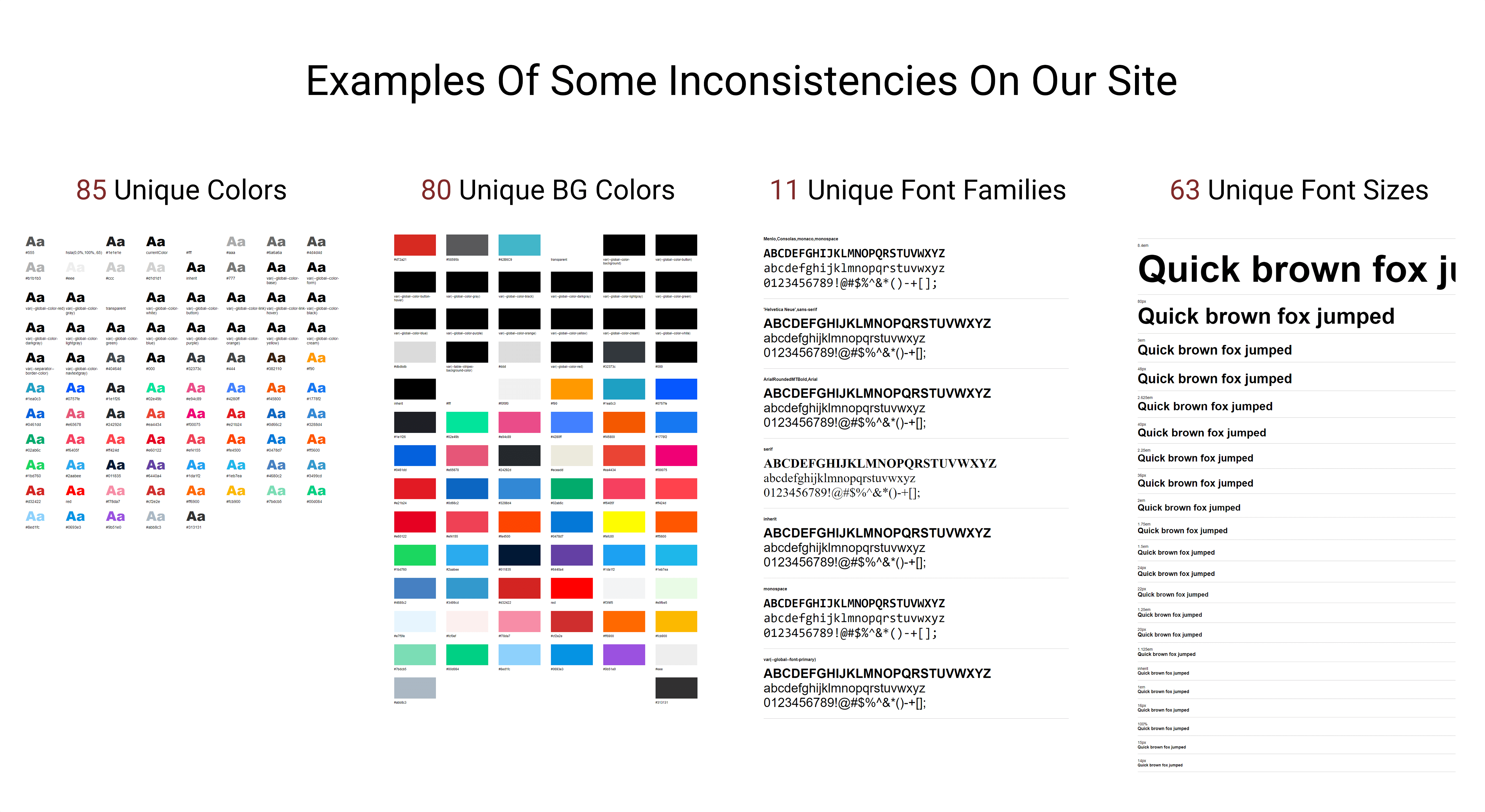
Listing The UI Inventory
The inventory process helped us clearly see all discrepancies and inconsistencies across our site and product. We conducted a full 4 day audit that ran by 1 designer and 1 engineer. The end goal for this exercise is to identify all inconsistencies in our design assets. We've split the workload in half to assess all of the components. As a result from this exercise, we were able to identify a list of inconsistencies.
Overall, the inventory process did help us see all of the issues within the same screen. Not only it served a foundation for our design system to move forward but we were able to prioritize which components should be reworked or removed then documentation for the new collective components.
The In-Between
To ensure the success of this project, it was important to get stakeholders and everyone is who directly a part of this project on the same page. We systematically promoted the initiative for the following:
By being proactive communication and being transparent in the early stage of this project, we would be promoting the understanding of the project to everyone and the benefits all internal teams will receive from it.
Design Exploration
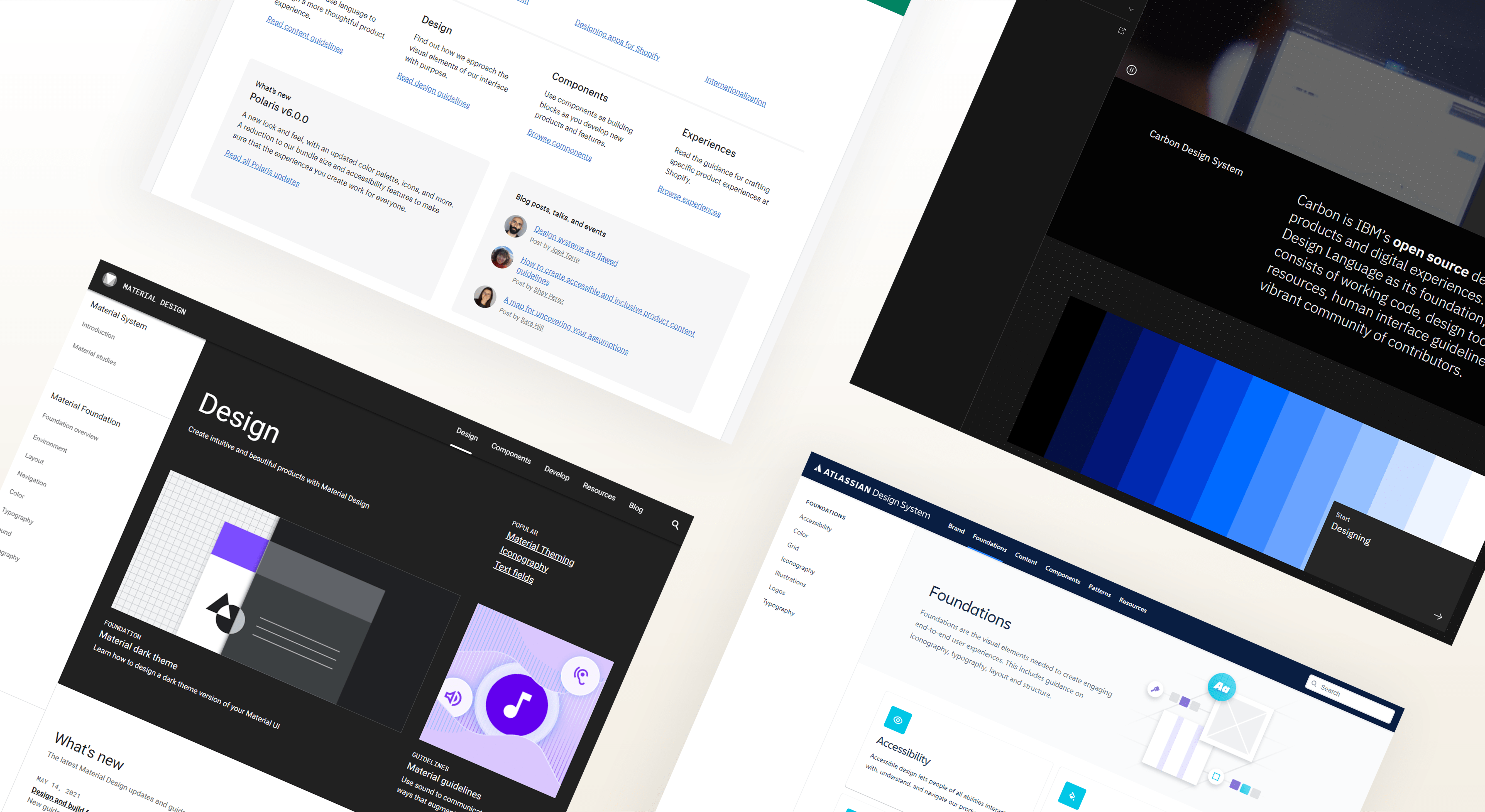
In this stage, I've explored on other notable companies who are already authorative in their design system. Some example design systems I've took note of: Google's Material Design System, Atlassian Design System, and Shopify Design System. Some takeways we wanted for our design system as follow:
Forming A Strong Communication
Reviewing work is an important part of any design process. It helps everyone to collectively navigate through with decisions and align on details such as visual designs, component designs, and documentations. For this project, we formed a tight schedule that would meet every week for about an hour to discuss the direction and progress of each other's work. We also set up a Slack Channel for design-systems, where we share our progress updates or concerns and requests for feedback. These practices allow us to gather everyone’s perspective and bridge the gap between design and engineering.
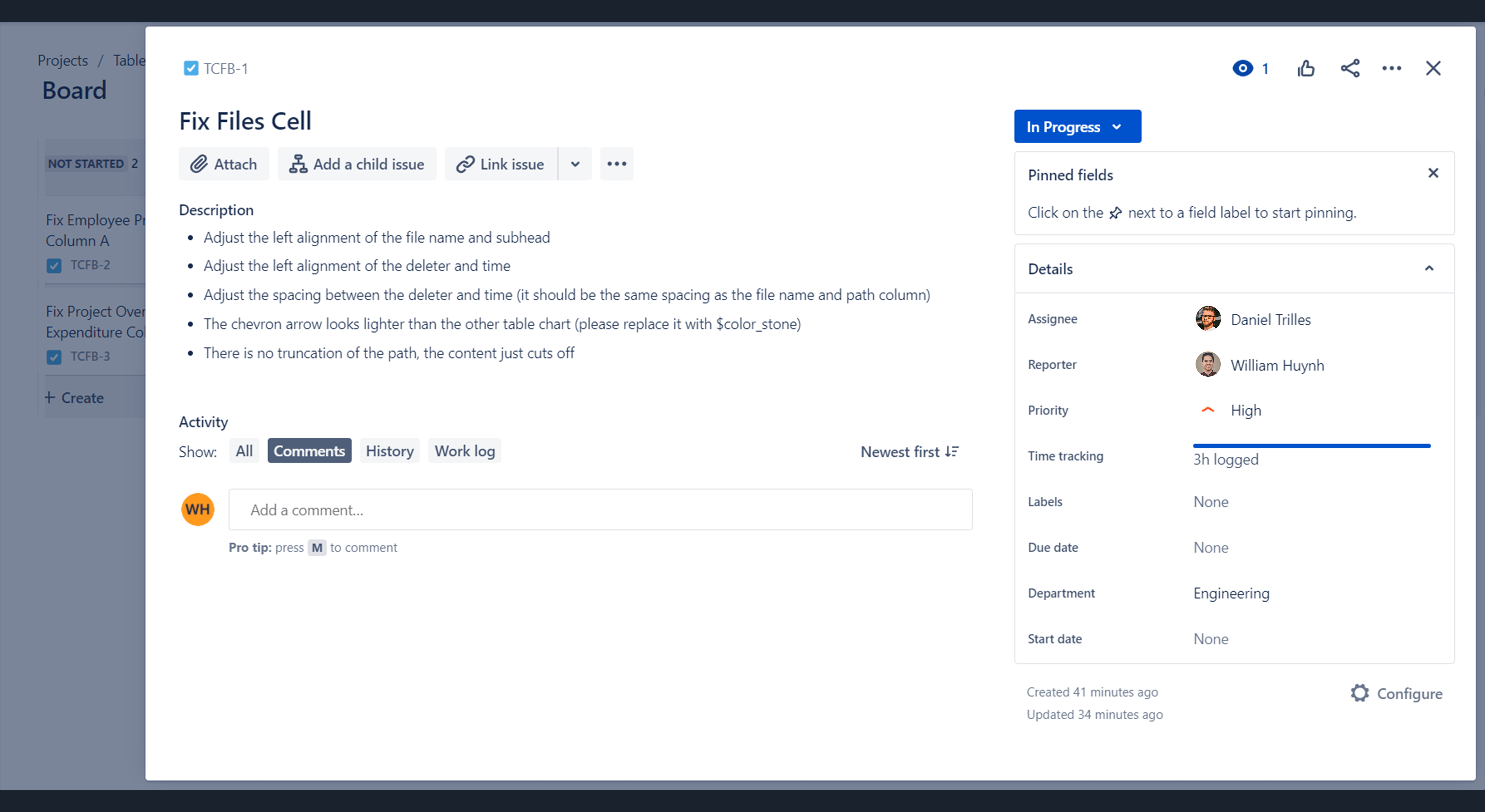
Accountability & Tracking Progress
In order to have full visibility on the project, a Jira board was created so designers and engineers can update their progress. With Jira, it helps us plan, assign, and track accordingly. It also helps move tasks to corresponding status (Open, In Progress, Done, In Review) throughout the process.
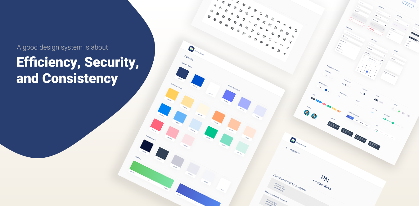
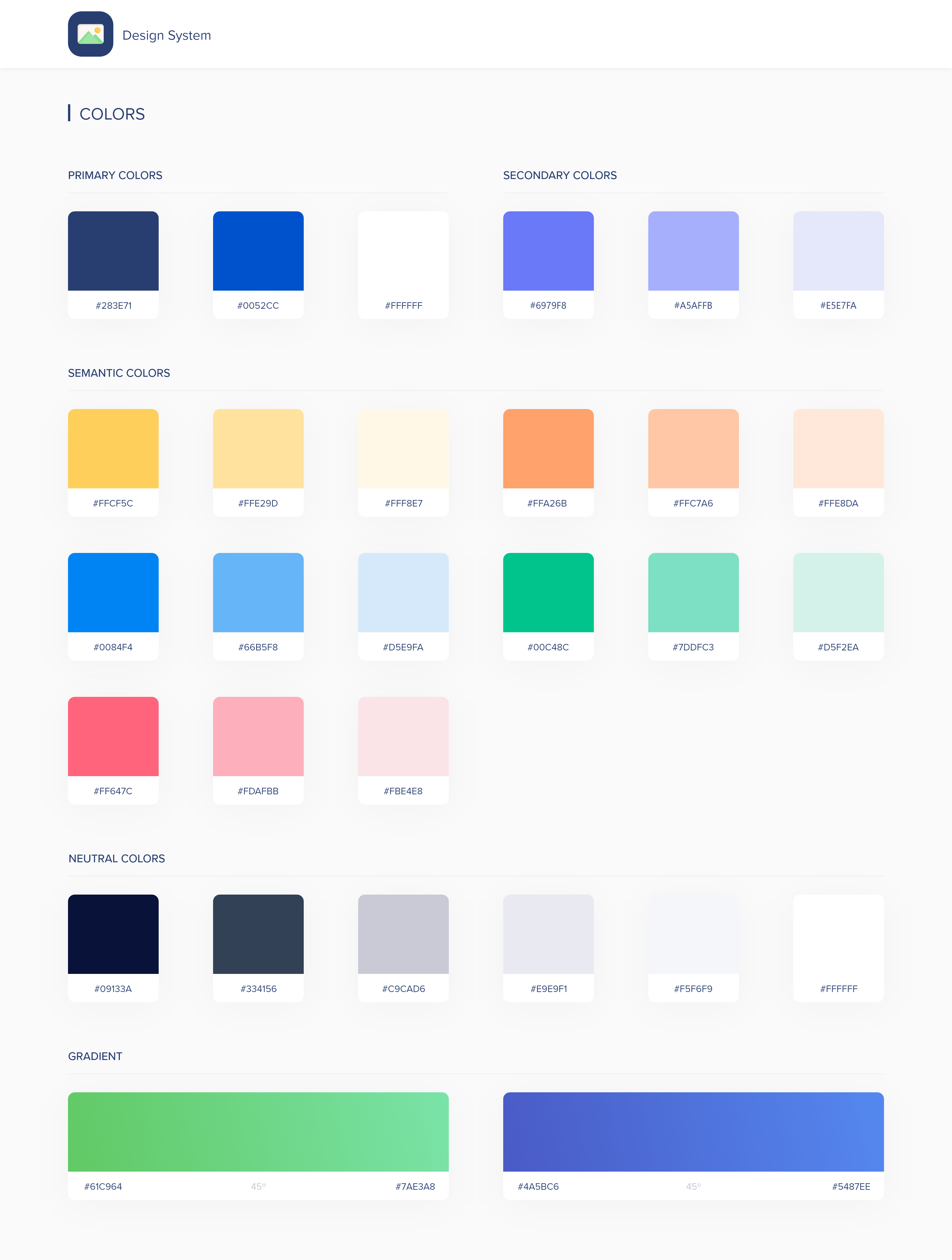
Color Palette
After our audit excerise, we were able to remove all of the colors that served no purpose for the new design system. Here are some of the key principles we factored for selecting colors: Colors should have meaning and they should follow accessibility guidelines.
We've organized the colors into 4 groups: Primary, Secondary, Semantic, and Neutral.
The colors palette meets the WCAG 2.1 compliant contrast ratios.This will help the experience of using the product more accessible.
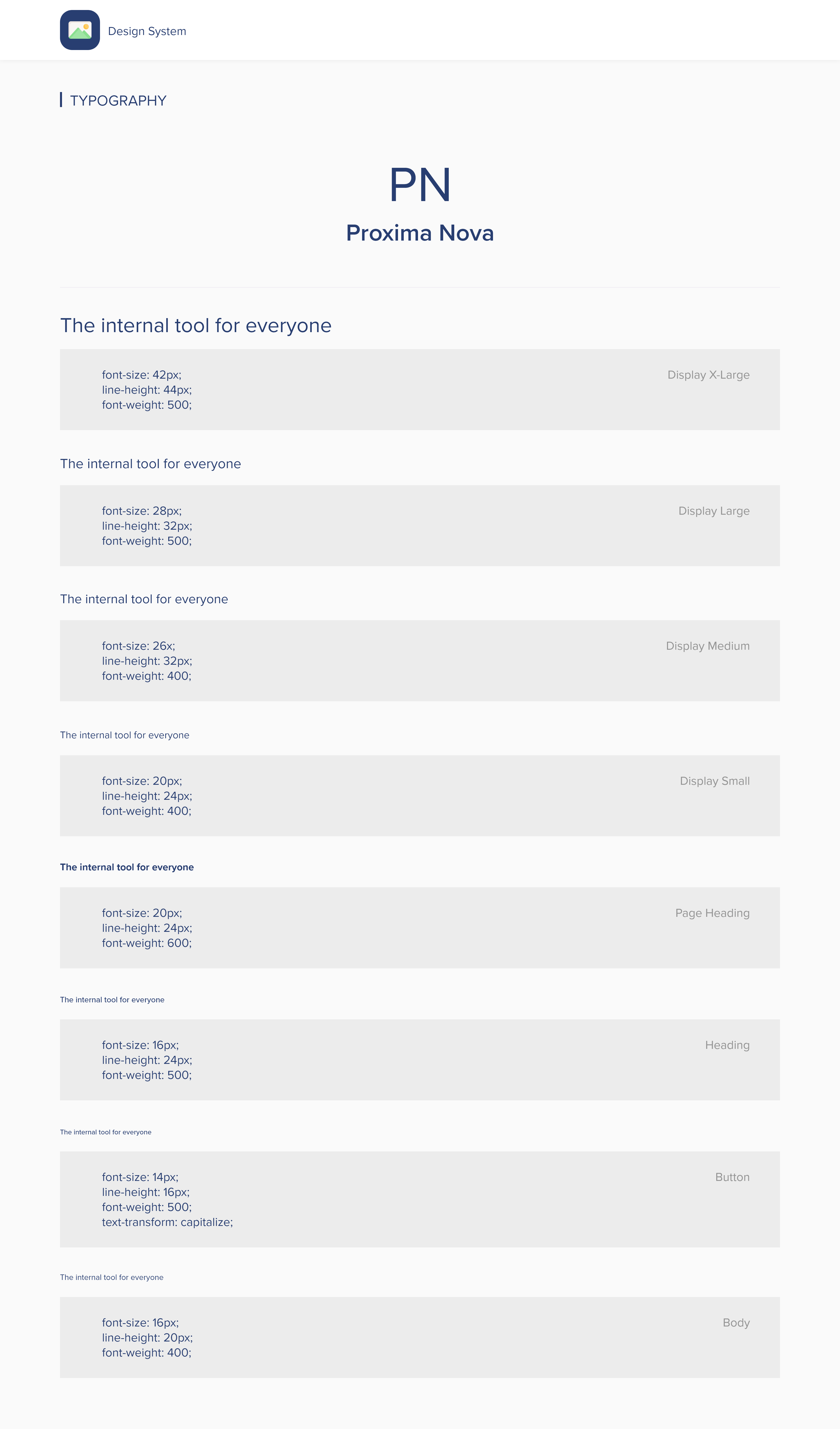
Typography
Out of the font families based on the CSS Stats, we went with Proxima Nova. It works well for all screens and it has great flexibility. The font is for almost everything; whether it's for branding or marketing.
In this design system, Proxima Nova is used in 3 different weights: Regular, Medium, and Bold. There are two versions of the fonts, one in light (#ffffff) and the one in dark (#1A051D). In order to meet the minimum AA-level WCAG web accessibility standards, all text is a minimum font-size of 16px and the line-height of 1.5px.
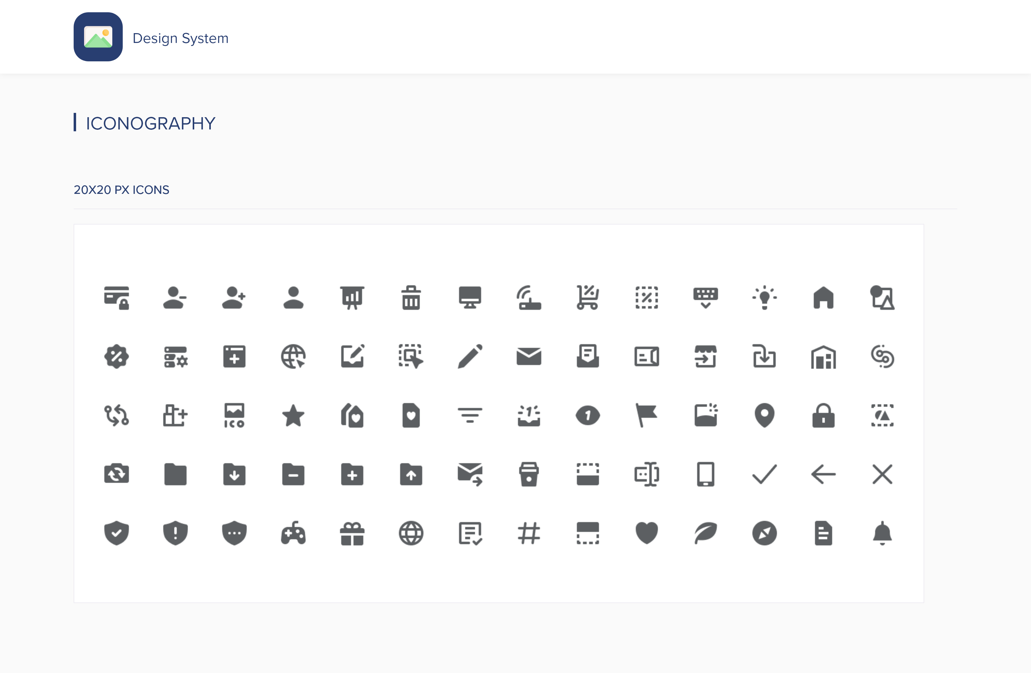
Iconography
There were a long list of unused and inconsistent icons during our UI inventory check. After grouping all of the icons into a designated collections, we've made a decision as a whole to remove icons that weren't aligned with the new design system.
There were a few existing icon library within the platform and I've chosen the Feather Icon library because it is simple, informative, and it compliments well with the overall visual language of the design system. In addition, I went with the simple icons because the other icon libraries were more details & mulitple color icons. This would increase cognitive load. Simplicity is key and it help users understand the concept of the icon represents.
When To Use
Icons are powerful visual helpers and should be used with care. Overuse quickly results in user interfaces that are visually overwhelming or distracting. Icons are commonly used:
Here is a sample list of the icon library:
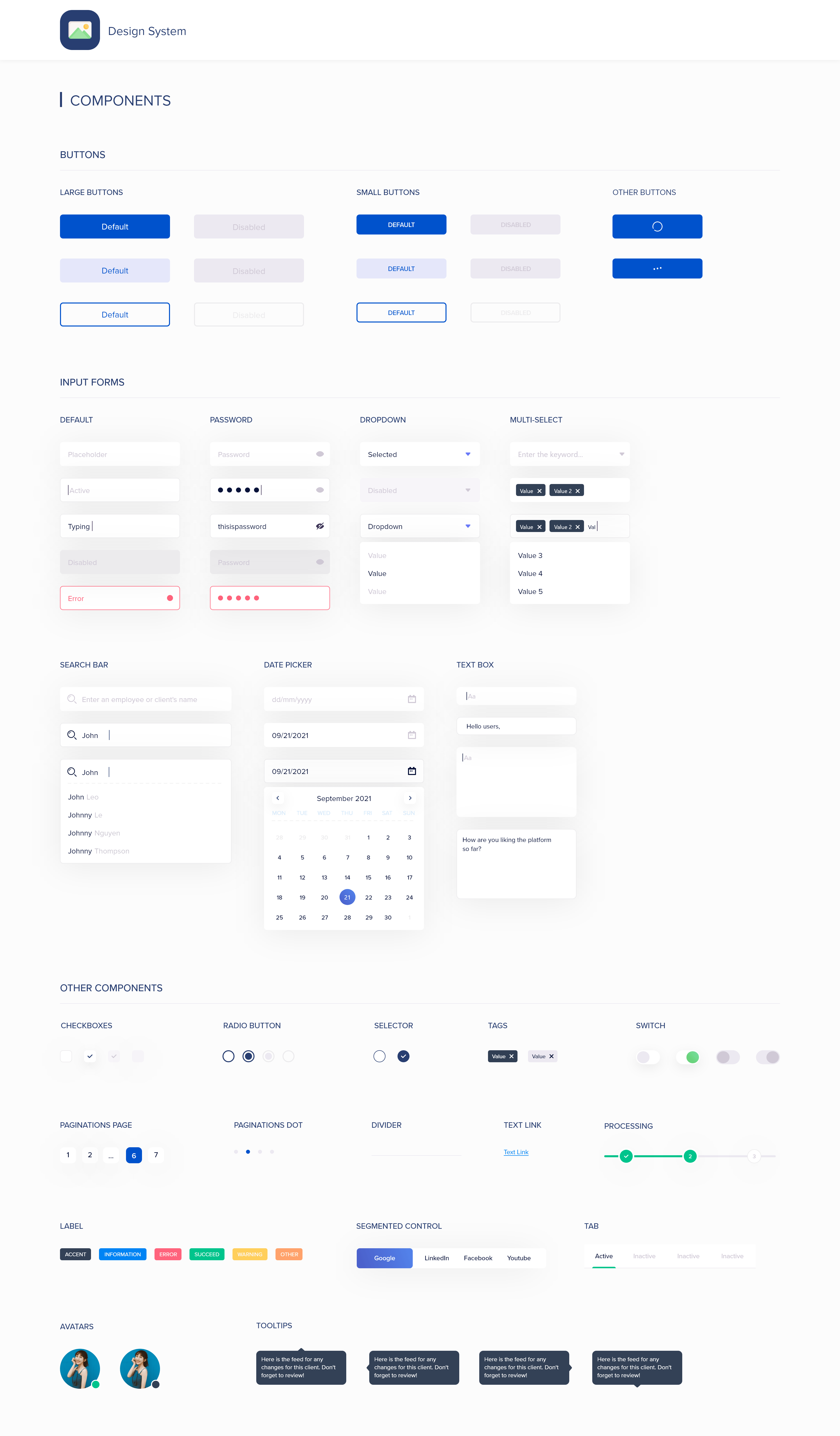
Components
They make up the heart of the new design system. Some examples listed below are call-to-action buttons, form fields, date picker, etc. After the collaboration effort from the team to make this all happen, it is now possible to reuse any components which speeds up the workflow, avoid different varations of one component, and saves time for everyone.
Note: All of the final design system content above are just a preview to what the full design system entails.
Even though it was a successful launch and my time was short for the project, I saw significant positive numbers in the data tracking. Here are some takeaways based on the 3 months analysis using a heatmap and the company’s internal tracking tool:
By casting strong villains, it drove urgency and necessity to the design system. Regardless of the project, research is always important. It helps lay a foundation and how we could move forward.
After completing the new design system for all departments, our team felt it was quite rewarding knowing this will push many positive impacts for the company. Even if it is as simple as a static website or a landing page, it will do wonders. If time permits, I would continue to take design ownership and partner with the engineers to ensure the new design system is efficient, secured, and consistent throughout.